Lottery Shop and Backoffice
LOTTO.COM is the gambling product first oriented towards the US market. I joined the project shortly after the launch on first state. With the MVP in mind, we continued to build and expand together with one college in UX, great team of developers and many other spectacular people who had much more experience in the gambling industry than I did before.
One of my tasks was to work with the historically incorrectly built design system and many layouts that were designed with inconsistency. The goal was to gain more consistency everywhere and correct all UX mistakes. A lot of reduction and simplification happened in the process. Some new features were born from complicated ideas, but in the end they are presented as simple for users.
In this case, I would like to present the most important parts of the work I have encountered in the first year of work on the project.
Short about
Design Systems
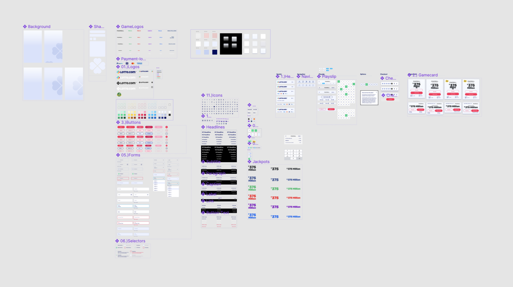
When I started, the design component library looked like this. A page in Figma where everything was side by side. I could not keep track of the order.
Some of the components were not linked to the design elements. Some of it was just outdated. Many designs were from the days of working in Sketch and many were not properly optimized for working in Figma.
No, no, no, we can't go on like this! I thought and set myself the goal of reworking the library.

10/2021
I wanted to create a well-functioning library, a qualitative design system for the product. It should always be up to date, all components must be linked to the layouts. Everything has to be organized in an orderly way.
The problem had already been identified. The way to solve it was also clear. We started with my colleague to go through all the layouts and see where and what was missing and outdated.
It was important to classify and divide the existing components. There are many different methods to classify the components in the system. Here, they were not particularly innovative. It was only important to make this structure understandable and friendly for ourselves. We are oriented towards the molecular system and have divided our components according to size.
We expanded the number of components, functionality and flexibility of the elements. We checked everything under the layouts and updated. Sometimes the easier update of the component did not work and we had to do a lot manually. But the effort was worth it.
Together with the development team, we had also updated the design elements in the product itself of course. All styles, typography, whole logic in the user interface was brought to a good point.
10/2023
Today, our design system continues to grow and small updates happen every day. We now have over 40 pages of components. We make sure that everything stays consistent and logical.


My personal goal was achieved. It is always better to put more effort in advance and get everything in order so that it will be easier to work with the system later.
Consistency
For us it is important to keep consistency throughout the user flow. Familiar elements help the user to learn the information faster and make the right decision on the page. Besides the visual and immediately visible elements should be consistent also the behavior and interaction of the design elements.